TechGuide
Turning a robust technical prototype into a desirable product for marine engineers and MAN clients
- Company
- MAN Energy Solutions
- Role
- UX Design, only designer on the team
- Years
- 2021–2023
- Scope
- UX audit, User research, Product design, Design systems, User testing
When I joined the TechGuide project, the app was a solid technical foundation created by skilled iOS developers. My task was to turn it into a seamless product experience which convinces both marine engineers to use it daily, and decision-making stakeholders to include TechGuide in every sold ship engine package.
- steps to get to a technical document
- 7 → 4
- overall UX of the new structure
- 5.9 / 7
- direct success in task completion
- 69.2%
UX audit
I began the redesign with a 24-page UX audit. I reached out to internal stakeholders, marine engineers and documentation specialists for interviews, and gathered their input on TechGuide and how it should fit into their workflow.
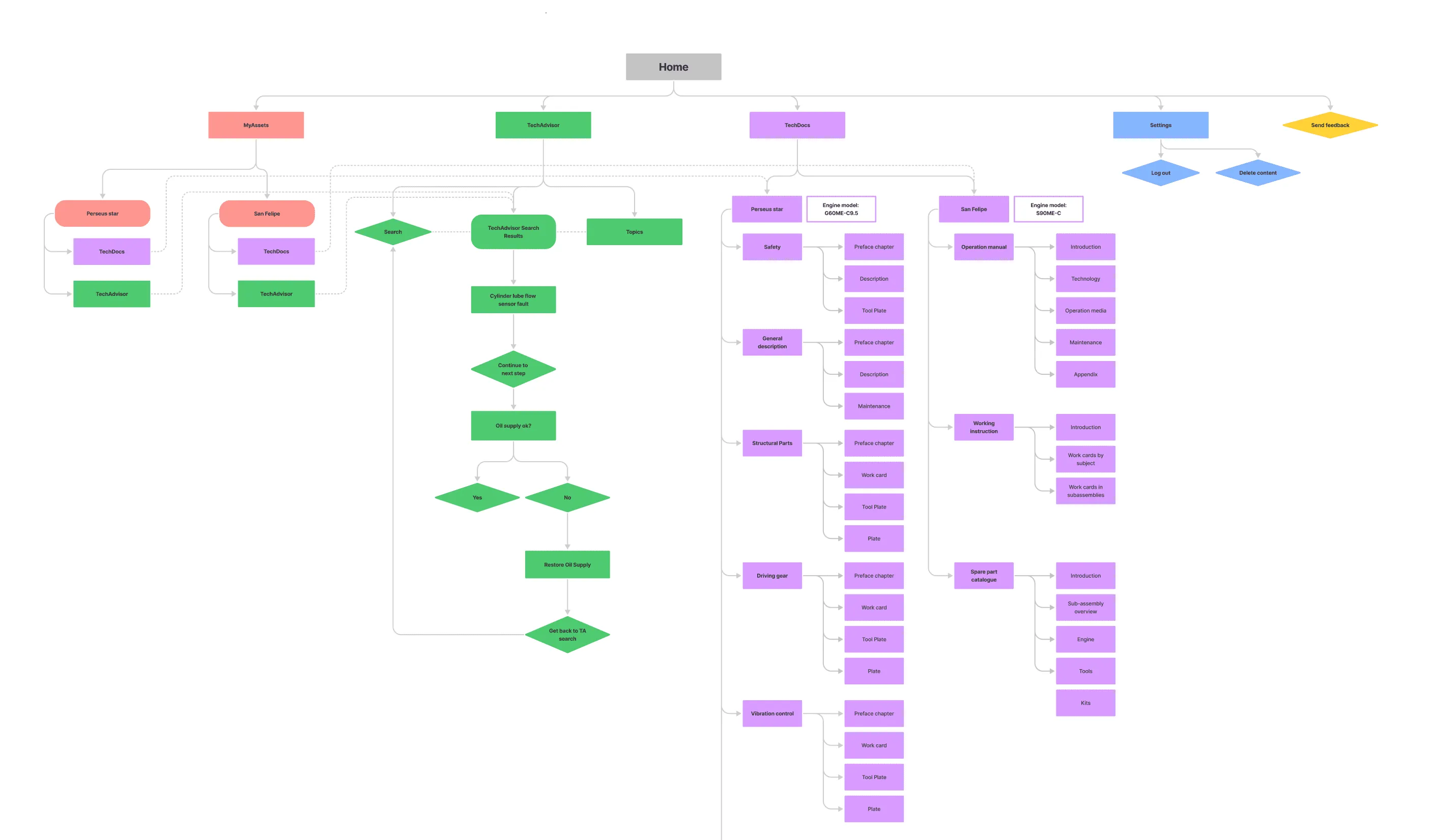
I also went through the app’s information architecture and highlighted problematic areas, pointed out visual design and interaction errors in the UI, and created a backlog of existing components for a future design system.
Everything under the ship
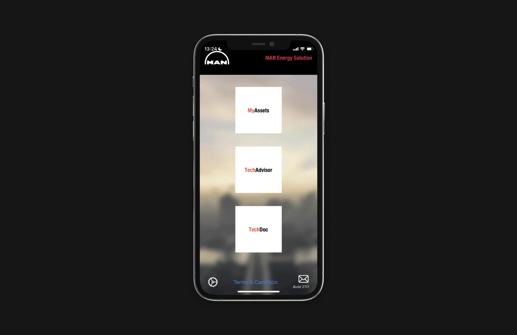
The main concept behind the redesign was to go away from the feature-based structure and integrate each feature under a given ship’s overview, as I learned that specific ships are the central reference point in everyone’s workflow. This way all the different user groups have the same overview of a ship, making it more efficient to collaborate.
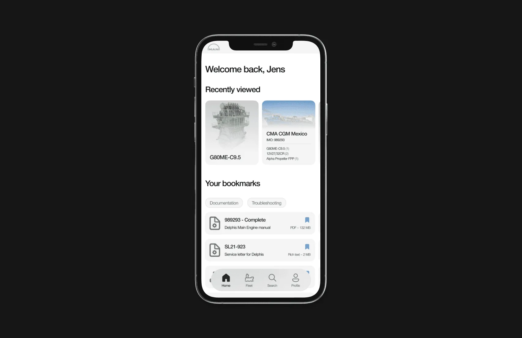
What I designed
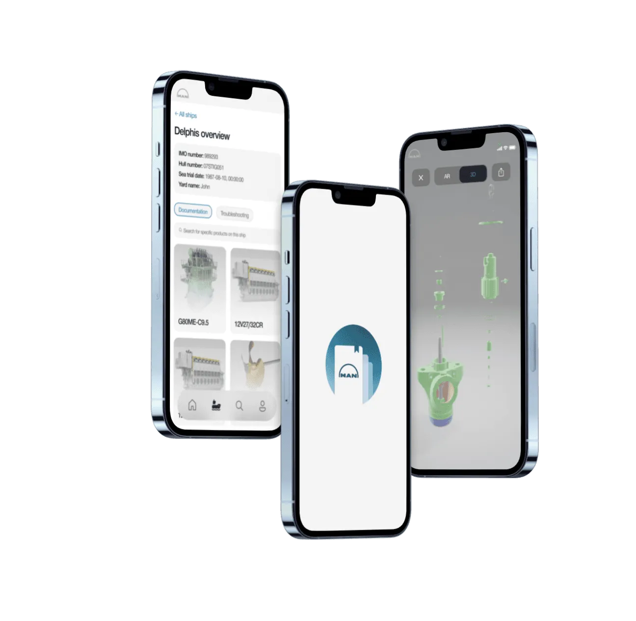
I wanted to introduce a new product language for TechGuide: subtly functional, with a more modern look. I started building a design system by creating new visual language guidelines.
New onboarding flow. It was important to introduce users gradually to the redesign, so I crafted an onboarding flow to prevent any confusion.
Accessing documentation. Efficiency and speed are key in a marine engineer’s workflow, so I wanted to reduce as many steps as possible in the hierarchy. I got it down from 7 steps to 4.
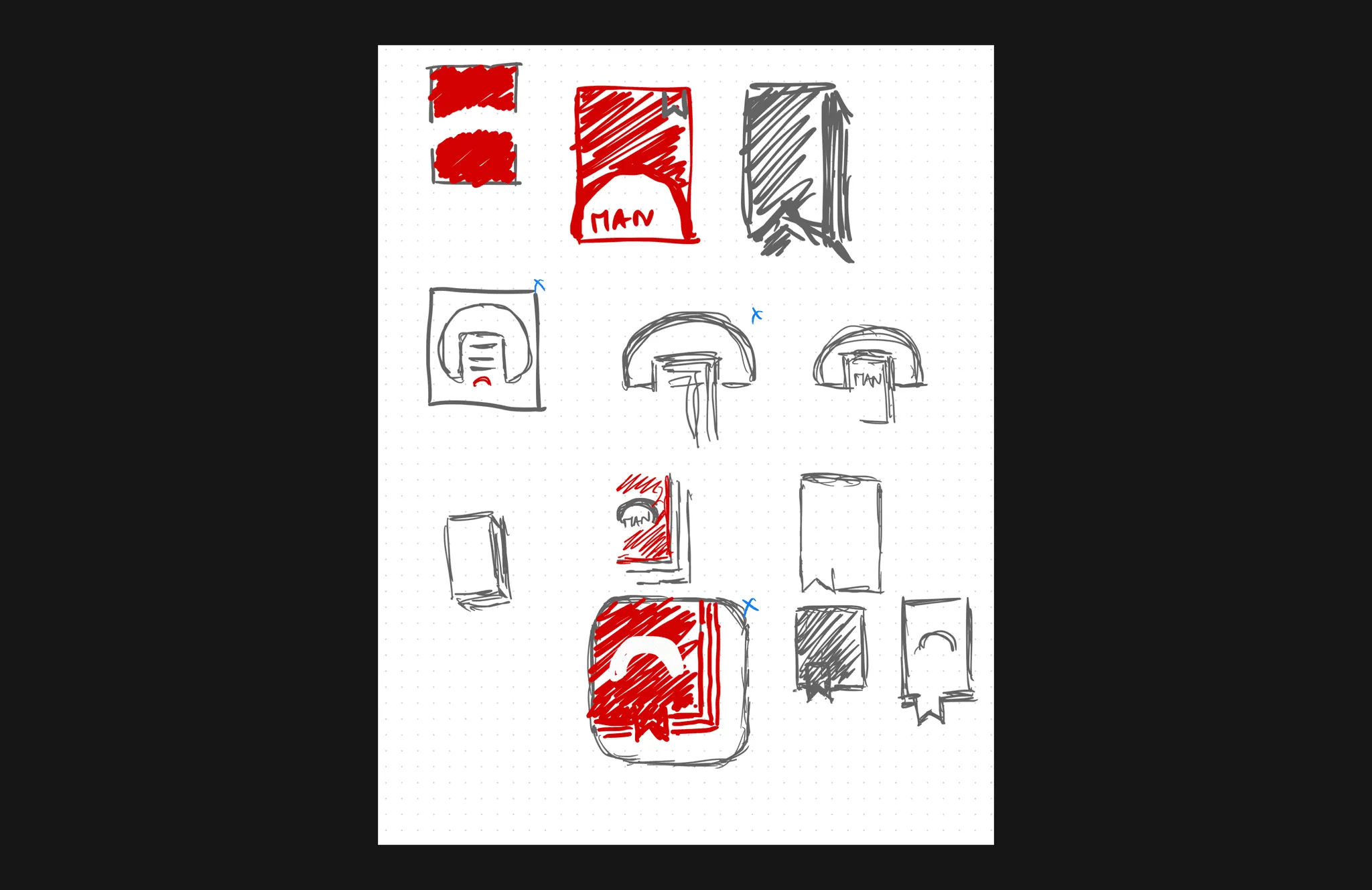
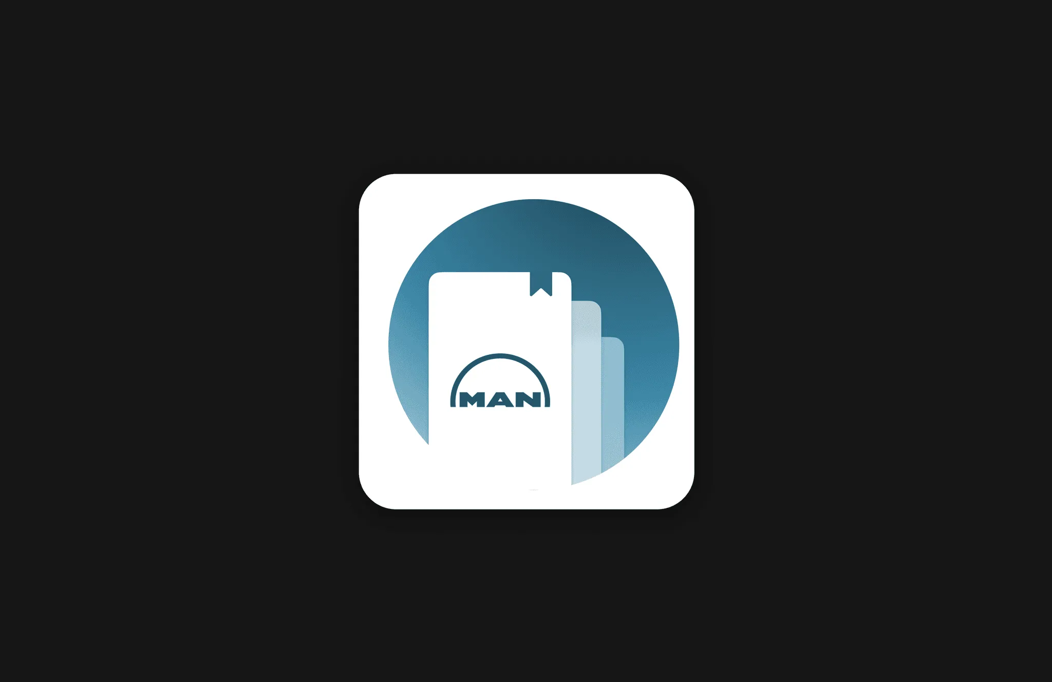
New TechGuide icon. Inspired by Ian Spalter’s approach to redesigning the Instagram logo, I asked stakeholders to sketch the old logo in 5 seconds, analysed the sketches to see which elements people remembered most, and created a new logo based on them.
Testing
I used Maze for formative and summative testing sessions. It was convenient to embed Figma prototypes and evaluate the user flows before handing over to development.
“Overall the system seems user-friendly, easy to navigate and very clear in terms of what you’ll find when browsing around.”
Impact
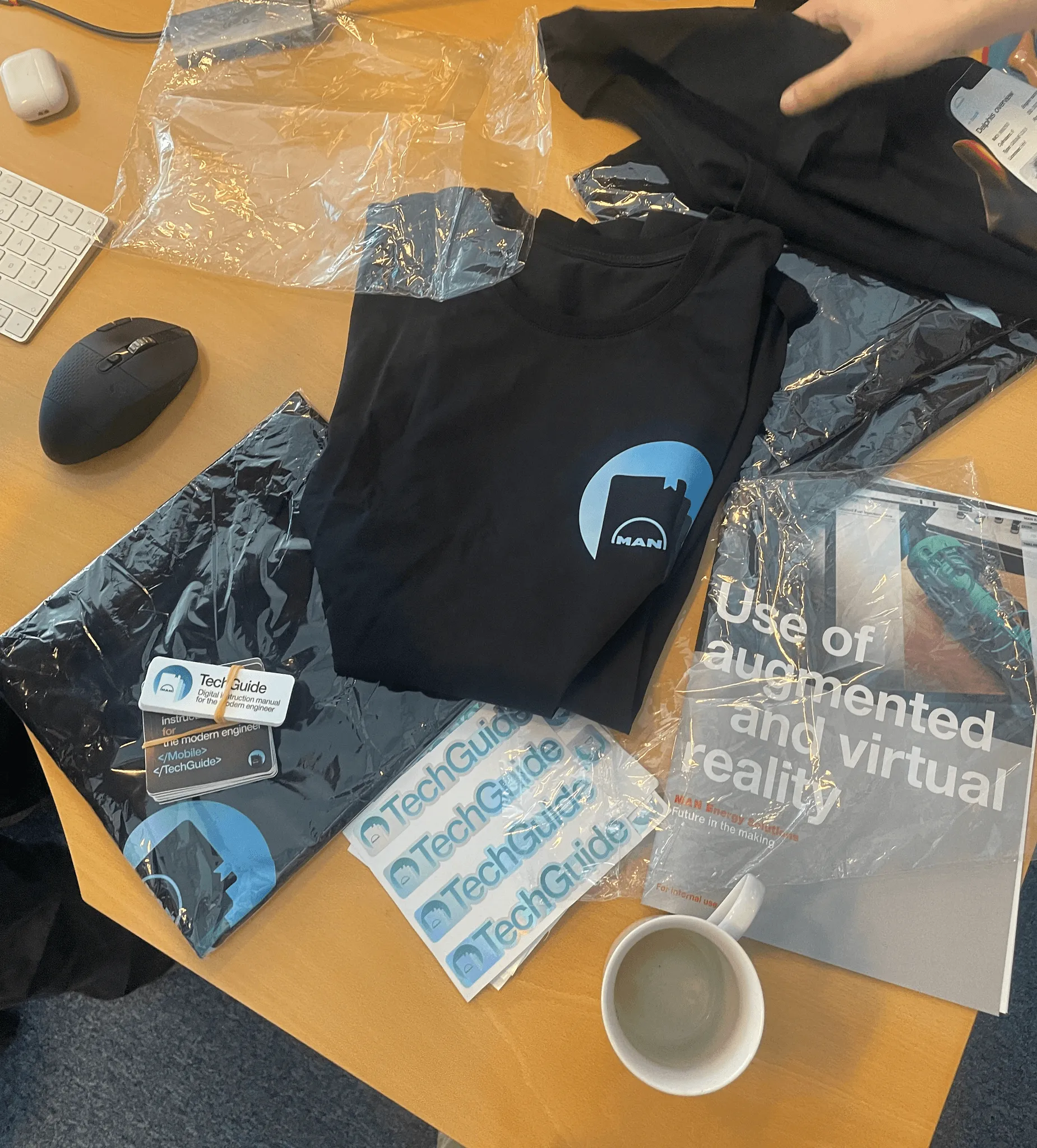
I’m proud of the redesign, as the app is used more frequently by end users than before. I’m happy that I could play a role in establishing a product culture in this small team as the only designer. I started bigger things like the design system, and smaller things like our first team merch.
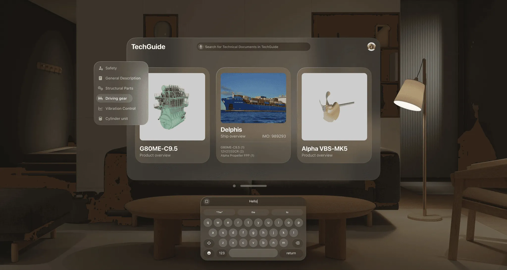
I’m excited to see how this team will bring new technologies like the Vision Pro into the world of technical documentation.